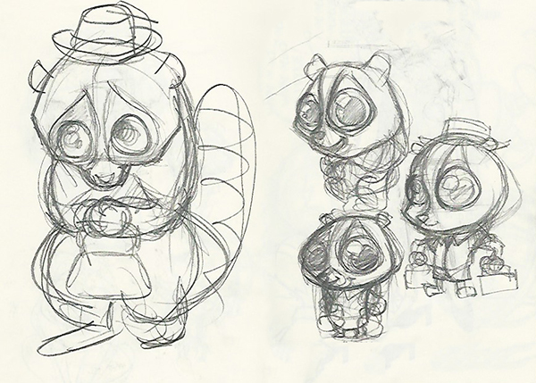
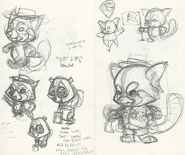
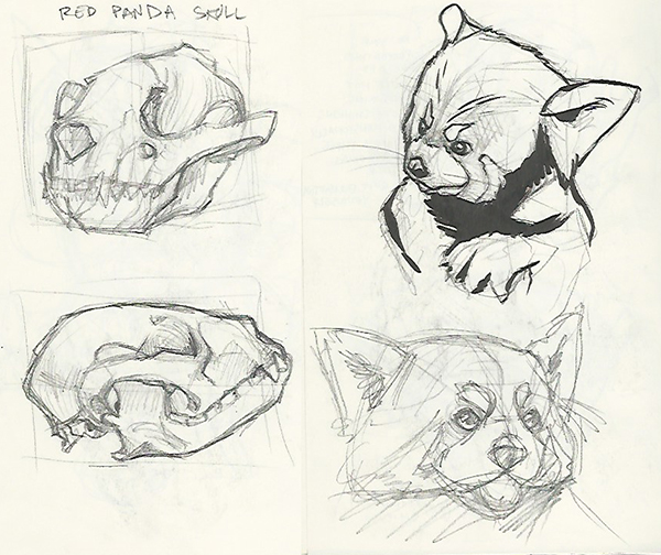
There are Twelve Principles of Animation. Rules that were developed by The Nine Old Men of Walt Disney Studios and applies, not only to 2D hand drawn animation, but to 3D animation. The Twelfth Principle is Appeal.
There is a reason why there are so many cartoon characters with big eyes and big heads. It reminds you of a baby. A what kind of horrible person hates babies? It is a very appealing look. So appealing that in more savage times, when one tribe fought the other and a baby from the enemy tribe was found abandoned, they would be adopted.
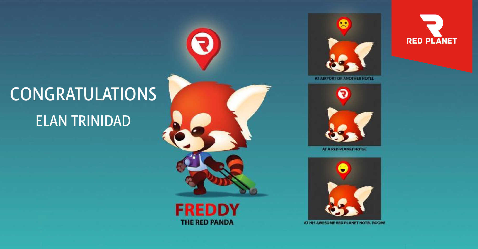
Freddy’s body is smaller than his head. He’s really top heavy, and I’m not sure if he could walk if he were a real life person. But his tail balances him out, at least visually.
You’ll notice, no hard edged. He only has round corners. He’s someone you want to hug and take care of.
I gave him kind of big hands and feet. Red Pandas have this, but also puppy dogs. I also gave him dark round eyes, sort of like Tin Tin, but played with the shape to give him slight Asian features.
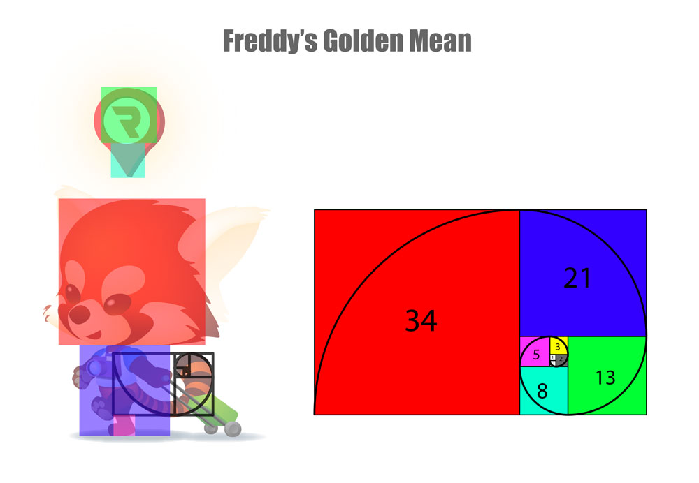
But probably the biggest thing about him is that his proportions coincide with the Golden Mean (or Golden Ratio).
The Golden Mean exists throughout nature. I remember, around the time I was designing Freddy, I was trying to draw trees and plants better. That lead me to watching a lot of videos about Fractals and the Golden Mean.
There’s a theory by comic book artist Scott McCloud. Its called Masking. The basic idea is that we go on our daily lives barely seeing our own face. We know where our eyes and nose and mouth are. We can point at them with our eyes closed. But we don’t have a clear image of our own face compared to your, oh, say your mother’s. This is the advantage of a cartoon character, he’s an Everyman. He’s an “Every hotel guest”.
I could easily put a bow on him and now he’s a girl. He has no race or ethnicity. So if someone had a problem with a certain race, their problems are never projected onto him. He’s just a red panda and a lot of people don’t even know what that animal looks like, but everyone agrees that pandas are cute. All he’s ever been are colored pixels and drawings in my sketchbook. Yet we call Freddy a “him” as if you’ll get to meet him some day. [But if they ever make a giant Freddy the Red Panda costume, I want to try it on! I mean, they already have two hotels in Japan and a third’s coming up. Really, just one Japanese hotel should justify a giant Freddy costume!]
* * * * * * * * * *
Here was my pitch (or description of our hero).
Freddy The Red Panda
Freddy (rhymes with “ready”) is a Red Panda. A location icon always floats over his head like a halo and glows a little too. He likes to travel around the World, but especially Asia because that’s the only place he can find a Red Planet Hotel. Whenever he’s found a Red Planet Hotel, the Red Planet logo appears in his location icon (this is meant to be his default icon). Whenever he is tired from a long plane ride or at another hotel, he is sad, and the location icon has a sad face. When he checks-in at a Red Planet Hotel and sees how awesome his room is, or receives excellent service from the Red Planet Hotel staff, he is happy and the icon has a smiley face. Freddy just loves Red Planet Hotels!
So my pitch was to make him THE ultimate hotel guest. And I was imagining an entire animated commercial with him. The backgrounds would be in real life. You would first see him coming out of the airport, jetlagged and tired. The locator pin would have a sad face on it. He’d call a taxi and the Red Planet logo would appear in te locator pin, as if telling the driver where to go. And when he checks in, th locator pin would have a happy face. And there he would relax, looking at the view from his hotel. Or maybe he would jump on the bed with joy. Or maybe he’d have a goodnight’s sleep.
I’ve seen the redesign of him where they removed the locator pin from above his head. I can’t say I’m not disappointed. After all, they deleted half of his original concept. But also, I signed the contract. He’s not mine and I’m on a plane ride to Okinawa right now.
When I travel, I feel a bit vulnerable. What if the luggage get’s broken into at that shady third world airport? What if you miss the train to the airport? What if someone steals my suitcase? Will someone pick pocket me?
And all these thoughts are realistic. And everything you do to prevent all this is the adult self.
But your inner-child wants someone to take care of them. They want to not worry about any of these problems. And as a hotel guest, you want to have as little worries as possible. So I felt he made a better hotel guest. He represents everyone, everyone’s inner child. That part of you that wants to be tucked into bed, even if its in a hotel in South East Asia.
So making him an employee didn’t seem like a powerful concept to me. He’s like those children who travel alone on planes. He gets taken cared of. He gets good hotel service. He’s just like you, like the audience, like the potential client. Heck, he basically is me, as I go on this big crazy travelling adventure of living in free hotels!
* * * * * * * * * *
I rendered him in Adobe Illustrator, which is perhaps the least intuitive program for artists. But what it lacks in artist friendliness, it makes up for in precision. It took me about a day to render him and turned him in only an hour or so before the deadline.
He was posted on a page with the other contest entries and I told as many of my friends to vote for him. He only got, maybe 20 votes? This other guy got over 200 votes. And when I saw that, I just let it go and didn’t think about it.
Some weeks later, after the voting period, I was at the gym for my morning work out. I was resting a bit, ready to get on the treadmill. Someone left a comment on one of Freddy’s photos in my instagram account. He congratulated me. I thought that was great, I was one of the finalists. But when I saw the facebook page, the five finalists were picked long ago. I won!
I attribute my winning to my pitch, my description. The characters were well designed and there was even another Red Panda, another character that utilized the locator pin, and another character pulling along their wheeled suitcase. I noticed none of these entries got triple digits in votes, and I guess the votes didn’t really matter.
I sent them my files, signed contracts and did paperwork. I also had to design a turn around sheet. As of now, I And now I’m about to land in Naha, Okinawa after a five day stay in Tokyo Japan.
